
GIBLIB Rebrand
Repositioning a startup to be the “Netflix of medical educationGIBLIB was the only company producing accredited medical education content with documentary-level production value. While competitors distributed PowerPoint slides or propped a tripod at the back of a lecture hall, GIBLIB filmed immersive footage straight from the operating table, in partnership with institutions like Mayo Clinic and Cedars-Sinai.
The product was Netflix-ready. The brand wasn't. As the first Creative Director the company hired, I was brought in to build their brand identity from the ground up.
01_The Rebrand
02_The Challenge
Disrupt, but not too much GIBLIB already had a meaningful user base. A complete brand departure risked alienating them. The challenge was to find a direction that was premium enough to match its cinematic production value, but familiar enough to feel like an evolution, not a redirection.

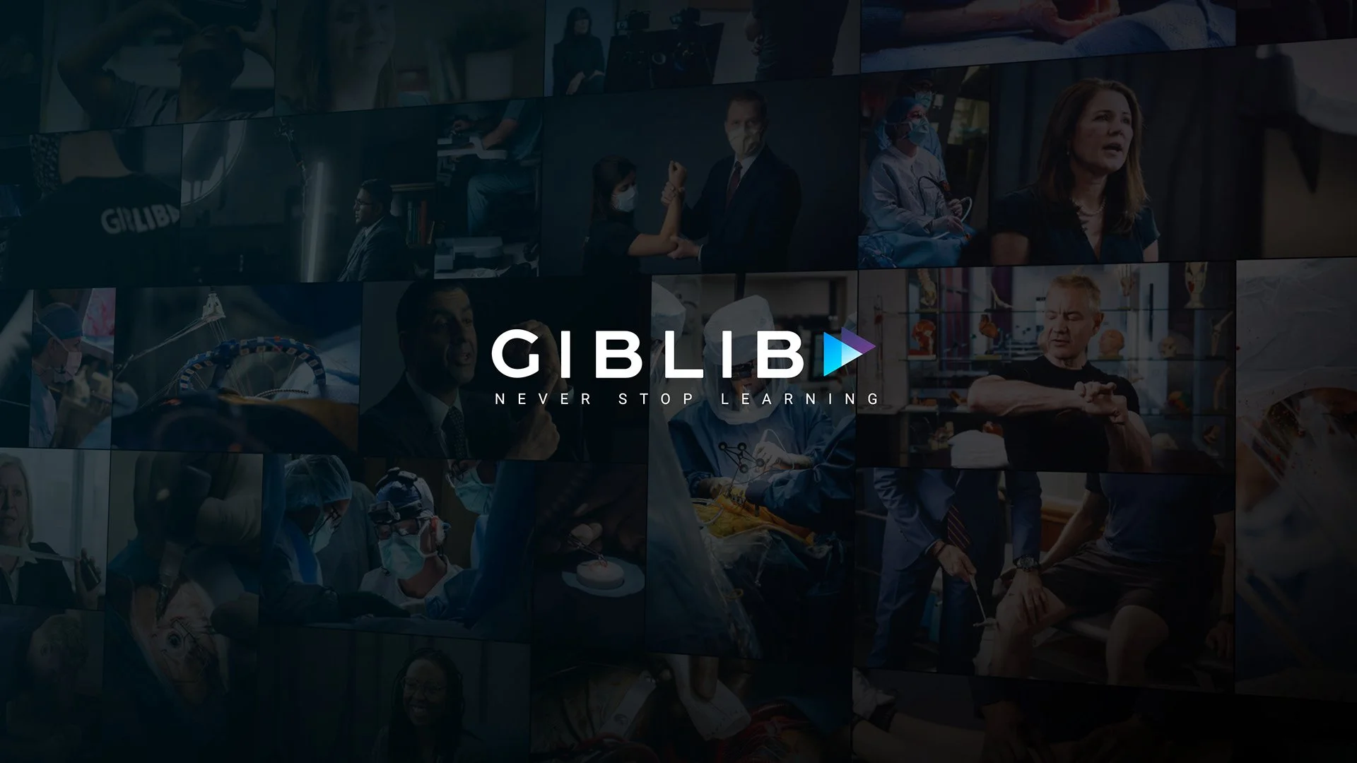
Before—Inherited logo, no official brand system. Visual identity felt interchangeable with any other health-tech startup.
The Ask
A comprehensive brand refresh:
Mission + vision alignment
Voice & tone
Logo
Marketing guidelines
Product design system for mobile app launch
03_The Insight
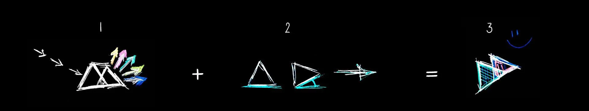
GIBLIB doesn't create content — it transforms it Working closely with the founders to define the company's mission, a key truth emerged: the real innovation wasn't the educational content itself — it was how GIBLIB transformed raw surgical footage into something compelling, inspiring…and maybe even enjoyable?
The triangular base of the existing logo was retained as the visual anchor, but we took inspiration from the transformational properties of the prism to give the triangle new meaning and dimension.
—A prism takes a single source of white light and transforms it into a vivid array of color.
The Evolution
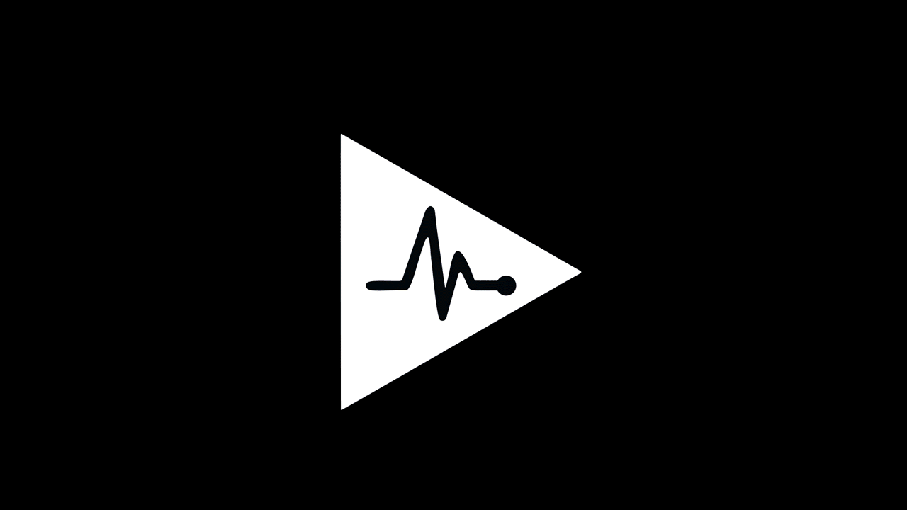
04_The Final Design
A compelling brand identity, ready to scaleBrand Identify RefreshLogo AnimationAnimation for Mobile App Launch