WDI Collection
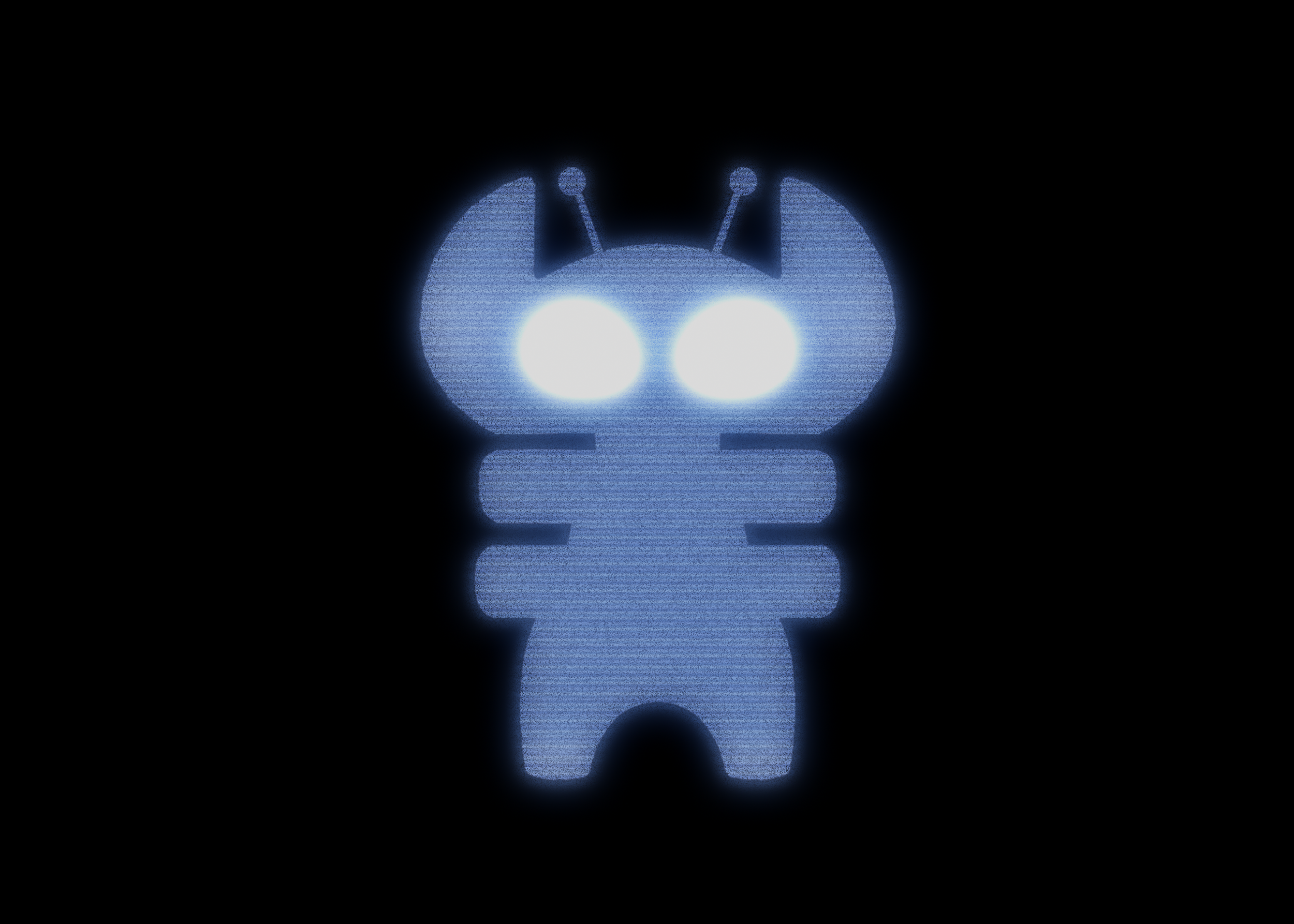
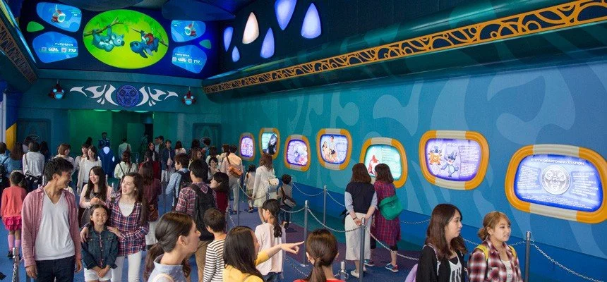
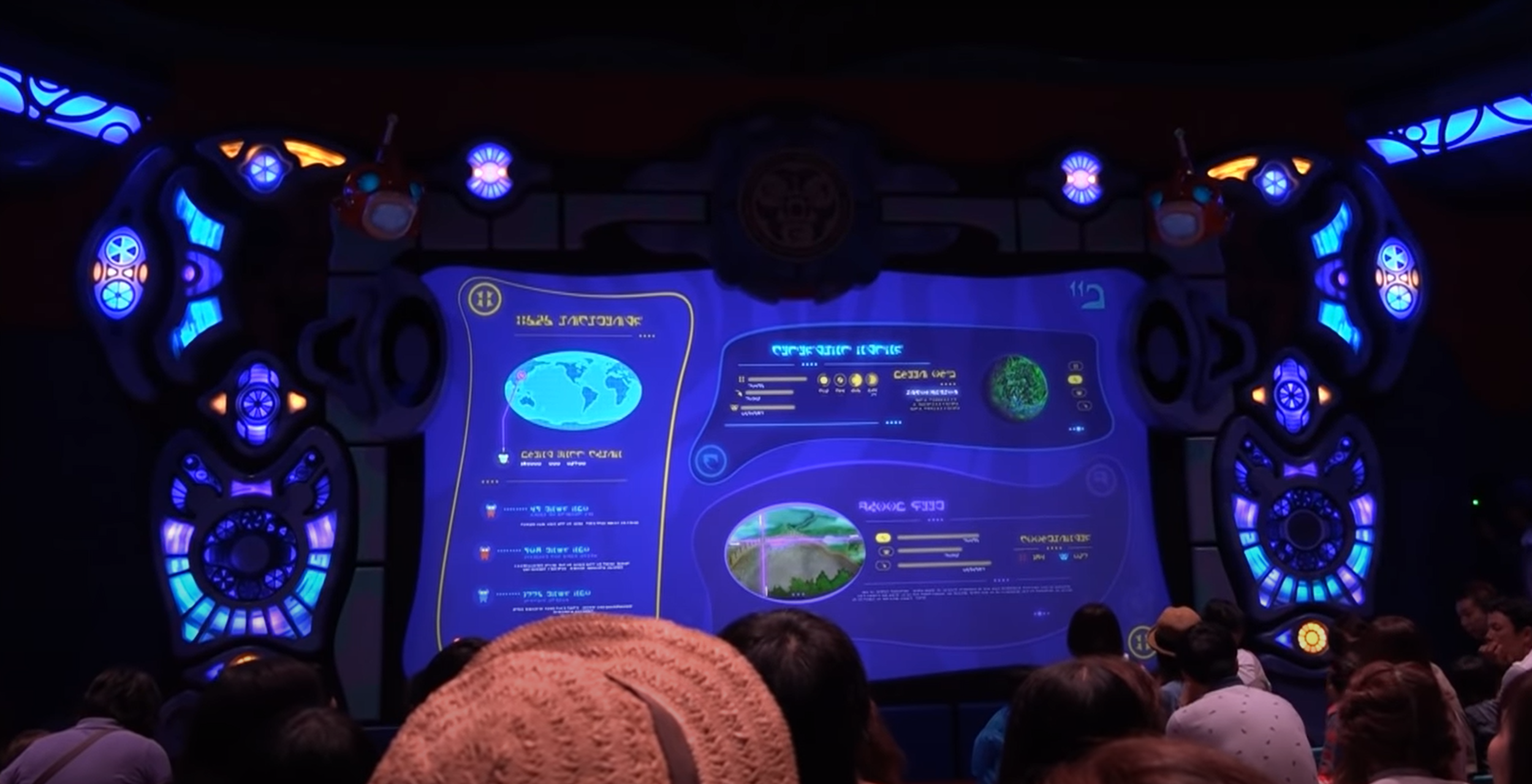
01_Stitch Encounter
Brand design & motionStitch Encounter is an interactive attraction at Tokyo Disneyland where guests are tasked with helping capture the universe’s most lovably destructive fugitive. A central focus of the show is a “badness meter” that tracks Stitch’s mischief in real time. My ridiculous job was to design the form and function of how this badness meter operated.
Working across both the pre-show and main show, I designed and animated the full suite of graphic elements that brought the attraction’s world to life on screen.
02_The Resort Channel
Brand design & motionThe Resort Channel is the first thing a guest encounters when they enter their hotel room at any Walt Disney World or Disneyland Resort property. It provides park hours, special event information, and resort wayfinding.
The brief was to transform static imagery into a dynamic video loop that was atmospheric and ambient — not a broadcast. Just some classic Disney magic.
03_Space Mountain Redesign
Logo design & motionSpace Mountain has been a fixture of Magic Kingdom’s Tomorrowland since 1975. When the attraction’s queue received updated safety video content, the Starport Seven-Five brand needed a logo to match — something that felt native to the attraction’s intergalactic spaceport identity.
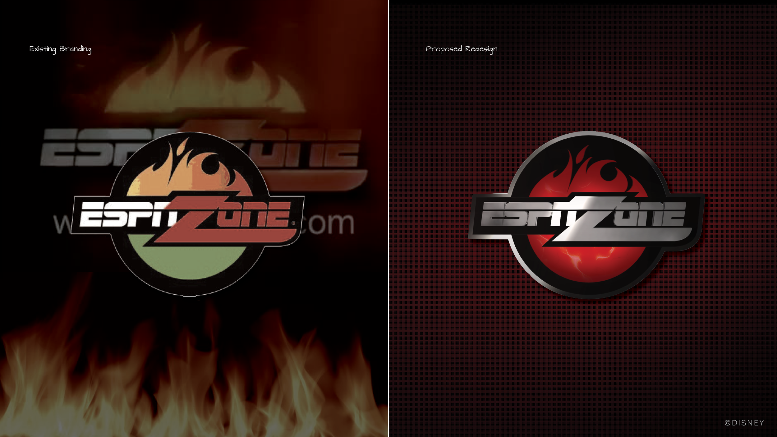
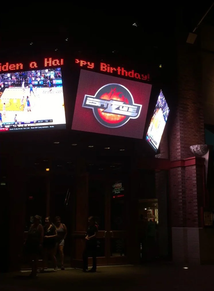
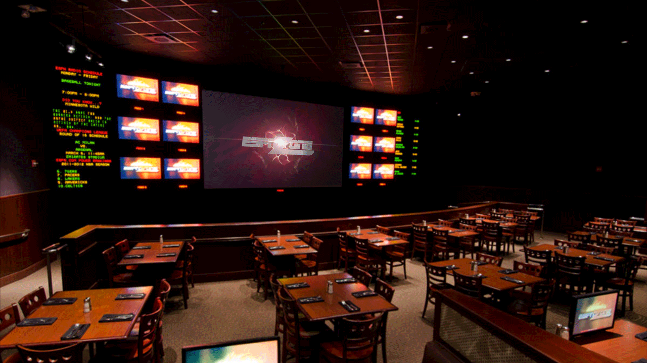
04_ESPN Zone
Brand design & motionESPN Zone (RIP) was a sports entertainment venue that took up prime real estate within Disneyland Resort’s Downtown Disney District. When the decision was made to overhaul their decades-old DVD-based playback system, a logo refresh came along with it. This was a rare opportunity to modernize a legacy brand identity that had been flat for years.
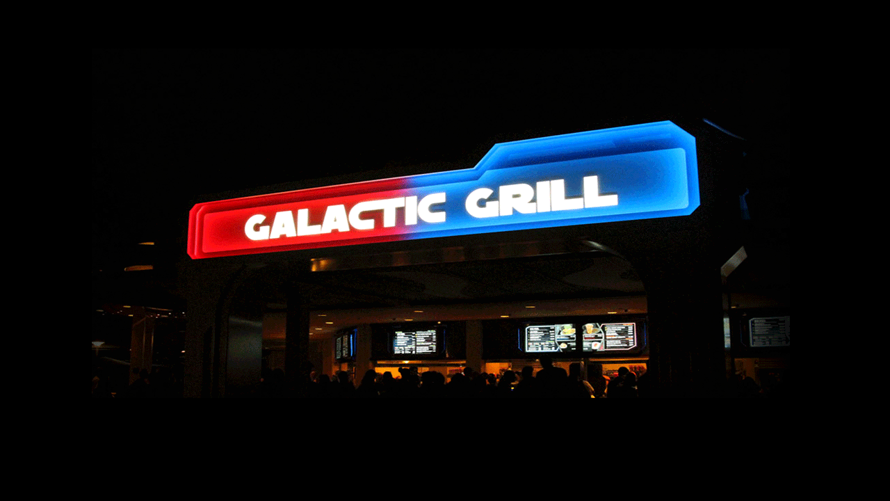
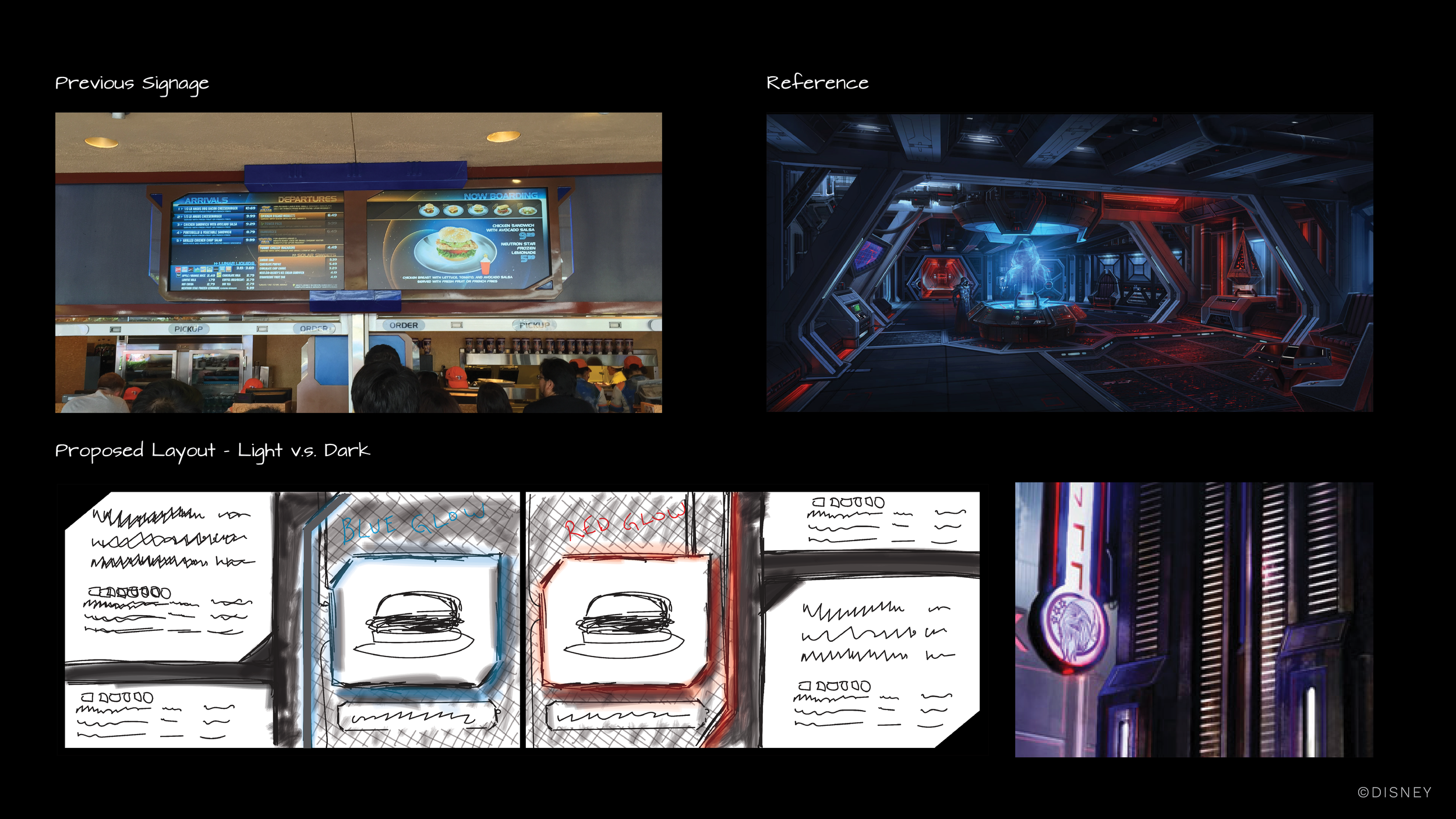
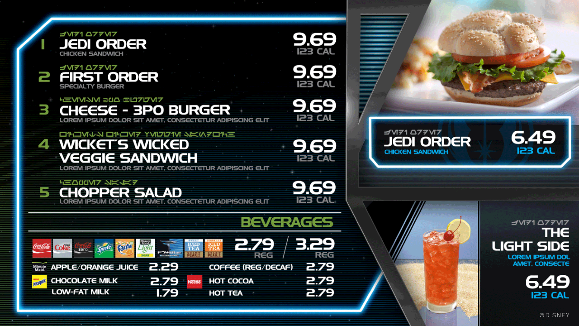
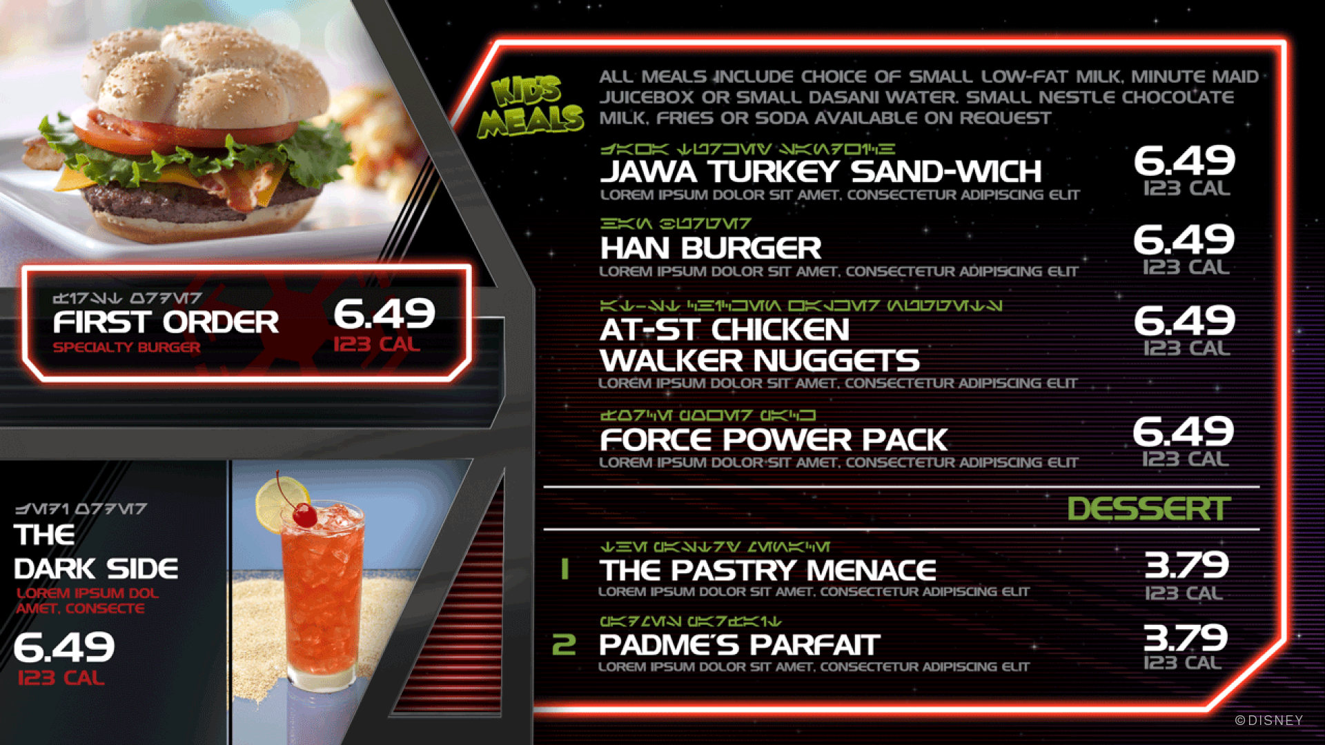
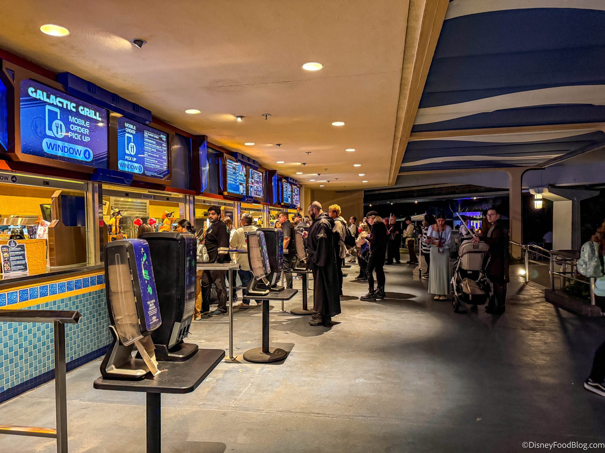
05_The Galactic Grill
Brand design & motionIn anticipation of Star Wars: The Force Awakens — Disney's first Star Wars film — Disneyland transformed Tomorrowland Terrace into The Galactic Grill. This was a moment of enormous cultural weight: Star Wars Land did not yet exist, and fans were hungry for any physical expression of the new era of the franchise.
These menu boards leaned into the foundational Star Wars tension: the light side versus the dark side of the Force. Rather than treating the menu just as a functional display, the design invited guests back into the tension. The menus became part of the experience itself, not just information architecture.